Color Theory
Color Theory explains how we see color. Let's start with the easy part. Everything you thought you knew about color is wrong.
Simple enough. But perhaps we need to go a little deeper so you can understand color.
This article is an introduction to color theory. This is a complex subject. To do it justice I will need to link to other articles that will treat specific areas in greater depth.
Introduction to Color Theory

We are used to thinking of color as something that is real. We think of it is a condition of an object.
“The apple is red”
As if redness is a natural condition of that apple, like its weight.
In fact the redness of that apple depends upon two other things beside the apple.
It depends upon the light striking it, and the observer of that apple.
The apple will have a mass even if no one is around to observe it. It will have a mass even in a dark room.
That same thing cannot be said about the quality we are calling red.
The Physics of Color Theory
You might remember, somewhere in elementary school, learning about the visible spectrum, or the color spectrum.
The idea is that our planet is bombarded with all kinds of radiation, but we can only see a small portion of it. Light with a certain frequency is red, at another frequency it appears green, and at another frequency it shows as violet. From one end of the visible to the other all the colors are represented, and we can see these same colors when we look at a rainbow.

Lets call this idea partly true. There is a visible spectrum and it does transition from red to violet. This visible spectrum, reflecting off our apple, is what makes it appear red. The apple happens to absorb the frequencies or wavelengths that are yellow, and green and violet, so we don’t see those.
The visible spectrum explanation falls short because we see more colors than are visible in the spectrum. There are colors that you find on an artist's canvas that won’t show up in a rainbow.
The Biology of Color Theory
Let’s look at another bit of scientific fact that we learned, perhaps in a health class. Our eyes have various cone-shaped sensors that receive the light. There are three different types of cones. One type is sensitive to light in the red frequencies, another is sensitive to light in the green frequencies, and a third to light in the blue frequencies.
 Graph showing sensitivity of S, M and L cones
This is true enough as it goes, but a little simplistic. Each of the three types of cones are sensitive to a broad range of frequencies, but they are more sensitive to certain frequencies. So light of a particular frequency is likely to excite at least two types of cones, and maybe all three.
The cones relate to the visible spectrum. We could see more of the spectrum if we had cones that were receptive to either the shorter or longer wavelengths that are outside the bounds of the visible spectrum. Some animals can do just that. They can see in the ultra-violet regions invisible to us. Other animals got the short end of the stick and live in a black and white world.
From a practical standpoint, we have to deal with what we have. Color theory is principally concerned with colors as perceived by humans. Light in the visible spectrum is what we have to work with.
But that does not mean we have to stick to the colors of the rainbow. In fact we perceive many colors that aren’t part of the visible spectrum. That is to say there are colors that don’t have a specific wavelength associated with them. Color theory examines why this is so.
The Psychology of Color Theory
All colors exist solely in our brain. In a sense colors are the brains way of interpreting complexity. When we see that red apple chances are it is not just one wavelength that is reflecting off the peel. It is likely to be several wavelengths. Most will be in the red-zone of the spectrum, but some blue or yellows might join them.
Now the brain has to figure out what it is seeing. It has a whole lot of reds firing but it is also getting faint signals from the green and blue receptors. What comes out is the deep red that we are familiar with when we see apples.
The eye and the brain work together to interpret the constantly changing combinations of wavelengths and reducing these down to the lovely abstracts we call colors. In the process it has created a palette that extends beyond what physics has supplied in the visible spectrum.
Color theory is as much about the interpretation of this information as it is about the physics of what we see.
Creating Colors with Color Theory
Colors that are formed from different wavelengths combined together are called metamers. Metamerism is a fancy way of saying that we can break colors down into some combination of wavelengths.
While this sounds like a dull academic exercise it has tremendous applications in design. As you view this computer screen you can see different colors because the computer can control little pixels that are going to emit one of three different colors. By controlling the proportion of what colors are being emitted the software controls the color that you are seeing.
Its not a perfect system, because the hardware varies from computer to computer. I’ve noticed that on my Chromebook, what is supposed to be apricot appears to be pink. That same color on my iPhone really does look apricot.
This same basic principle can be applied to the paint on your walls. Take a paint chip to the paint store. They can analyze that chip, determine what frequencies bounce off the chip, and then determine what pigments they have to add to the basic white to get that same color.
Color Theory and Illumination
However, with paint there is another layer of complexity. With the computer screen they can control the light coming out. With the paint, the paint company can’t control the light that is going to hit that paint.
Sunlight has a broad spectrum. It is emitting light in wavelengths that cover the whole visible spectrum. Light bulbs have a different profile. Unless specifically designed to mimic the sun, they tend to leave out parts of the spectrum, which means that light green that looked perfect in the daylight, looks strangely white in the fluorescent light. This is sometimes called “illuminant metameric failure” although you will never hear me using that term. (Oops. I just did.)
This is why you don’t buy a car at night, under the dealer’s flood lights. That beautiful blue just won’t look the same on the day you pick it up.
This is also why energy savings alone should not dictate the type of light bulbs you use in your house.
At work we have a lighting booth. I can view painted parts under different types of lighting including one that simulates sunlight.
Gloss and Color Theory
 The top picture is of a plastic part that is the same color as the bottom picture, but it has a light texture to it. This reduces the gloss and makes it appear lighter.
The light source is not the only concern with reflective surfaces. The gloss level of a paint, or any kind of surface, will affect how the light reflects. A glossier surface will appear darker than a rough surface. If you are picking out your glossy trim paint based on flat color samples you are likely to be surprised when you get home. It might seem a whole lot darker than you had planned.
Likewise if you are touching up your walls, but you picked up flat this time and had used eggshell originally, there will be a mismatch between the old and new paint. You’ll swear the paint store messed up your order. Nope. It was you.
The same applies to wood varnishes. That high gloss varnish will appear darker than the same color in a dull matte. If you want to keep the wood light in color avoid the high gloss finish.
Color Systems and Color Theory
Our eyes make use of these three different cones to create all the colors we know. Likewise your computer makes use of three different color emitters to create all the colors that you can see on your computer screen. Color printers lay down a matrix of colored dots, which also take advantage of this effect.
To represent any color all you need are three numbers, each representing the relative proportion of three different colors. These are called tri-stimulus values.
But what three colors should we use?
Early color theorists developed the idea of a color wheel divided into three primary colors. These were red, yellow and blue. Between the red and yellow was a secondary color, orange, made from mixing equal amounts of red and yellow. Between yellow and blue was green.
When your computer creates colors on your screen it uses red, green and blue for the tri-stimulus colors. I believe these were chosen because these correspond to the cones in our eyes. As a shorthand this is called the rgb system.
Paint uses a different system, the ryb, or red-yellow-blue system. With paint, adding all the colors together makes black. Each color is formed by a pigment. Red pigment reflects red, but traps the non-red wavelengths of light. Yellow pigment does the same, but with yellow. Add the red yellow and blue pigments together and all the visible wavelengths get trapped. In order to make a color appear lighter than its three pigment combination you need to add white pigment, which traps nothing and reflects everything. In a sense what you really have is a rybw system.
With a computer screen red, green and blue all firing together make white light. To make something darker you simply keep the pixels dark, which is rather like adding black. Since turning on a pixel is adding color to a dark screen this is known as an additive color system.
Modern printers use a different set of colors. They use cyan, magenta, and yellow, but to control how dark something is they add black. To make it lighter they rely on the white background of the paper. This system is known as the CMYK system, where K stands for Key which really means black. Since B could mean blue, they needed another letter and K is what they came up with.
Cyan is a mix of blue and green which makes it the complement of red on a rgb color wheel. Magenta is the color midway between blue and red, which makes it the complement of green. Yellow breaks the mold. It is not the complement of blue.
Why were these colors chosen? They could have chosen other colors, but these are standardized dyes, so that yellows across the industry are the same yellow, magentas are the same magenta, cyans are the same cyans.
There are some printing processes that use additional colors, like light cyan. But even though this adds additional colors to control the principle is the same. By controlling the proportion of colors laid down on a page we can create any color that we want.
With printing you start with a white page, and you add ink to subtract colors. Where you add yellow ink, you go from seeing all three colors combined into white, to only seeing yellow. In a sense the application of yellow ink subtracts magenta and cyan. Therefore this is known as a subtractive color system.
Color Space and Color Theory
In another article I deal with color wheel charts, so I won’t go into detail here. What I will discuss is rather an extension of the idea of the color wheel.
The color wheel is a two dimensional representation of color. We can extend this representation into three dimensions.
One way to do that is to add a z-axis representing lightness, or darkness. On the x and y axis you have the color wheel, except instead of dividing the colors into three primary colors we divide it four-ways. On the x-axis you have magenta on the plus x-side and green on the minus x-side. On the y-axis you have yellow as the plus y and blue as the minus y.
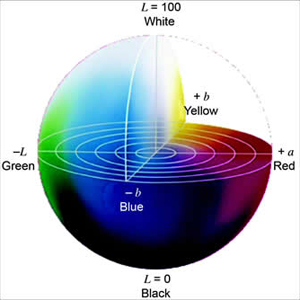
Color Theory and the Lab Model
This system is used by the people who measure colors. They alter the axis names. Z becomes L for “Luminance”. The x-axis is called “a” and the y-axis is called “b”. Together they from the L-a-b system. A positive value for L means the color is lighter or whiter than the standard color. In traditional color terminology this is a tint. A negative value is darker than standard. Traditionally we call these shades.
By applying colors to this three-dimensional space we can use Cartesian mathematics to compare different colors.
For the L-axis a value of 0 means a color is absolutely black. 100 is the top end for lightness. While the a and b-axes are unbounded, as a practical matter the upper end for red is +a=127, while -a=128 is the greenest of greens. +b of 127 is your ultimate yellow, and -b of 128 is your pure blue.
As the a and b numbers get closer to zero they become more neutral. Numbers further from zero are brighter. Sometimes this is referred to as having more chroma.
This Lab color space was developed by the Commission Internationale de l'Eclairage' or CIE. Translated into English this means 'International Commission on Illumination'. While illumination may have been its original area of interest it is the principal coordinating body for matters related to color theory.
The CIE also has other models or color spaces. I won’t go into the detail except to say that the science of accurately describing color continues to progress. The CIE has proven useful for developing standard ways of measuring and comparing colors. In my own world of the automotive industry the Lab system is often used to ensure color harmony.
Color harmony in this case means that the yellow on the plastic bumper cover matches the yellow on the stamped metal body. The instruments we use to compare the two colors give Lab measurements so that we can understand how they differ. However the critical measurement is always made by the eye. No matter what the readings say, if the parts don’t look like they match, then they don’t.
Here is one of those areas where our biology and our psychology, our eye hardware and our brain software, trumps the mathematics of computers. It turns out that we are more tolerant of changes in chroma than in hue. Or we could say that we are more sensitive to changes in hue than in chroma.
It also turns out that we are more tolerant of changes in hue the more chroma there is. As we move further out, away from the center it takes a greater change in hue for us to notice.

Likewise changes in lighter tints are less likely to be noticed than a similar change in darker shades.
Further complicating matters we can detect even slight differences in reds, whereas with greens our brains are not nearly so fastidious as with reds.
The above picture is a representation of how we differentiate color. The larger the ellipse the more tolerant we are to subtle differences. The smaller ellipses, such as those in the red zone, indicate our heightened sensitivity to minor changes.
Color Theory and The Lch Model
A better model for capturing these oddities is the Lch model. It is basically the same color space as the Lab, except we measure chroma and hue (the c and the h).
Chroma is measured as a straight line distance from the center, while hue is measure as an angle around the a-b plane. Starting at red you work your way around the color space until at 360 degrees you are back at red. Any changes in hue show up as differences in angle. Any differences in luminance or chroma show up as a distance from the center.
It is a better model because we can clearly distinguish between hue and chroma. If we are comparing two colors we can give more weight to differences in hue, and less weight to differences in chroma.
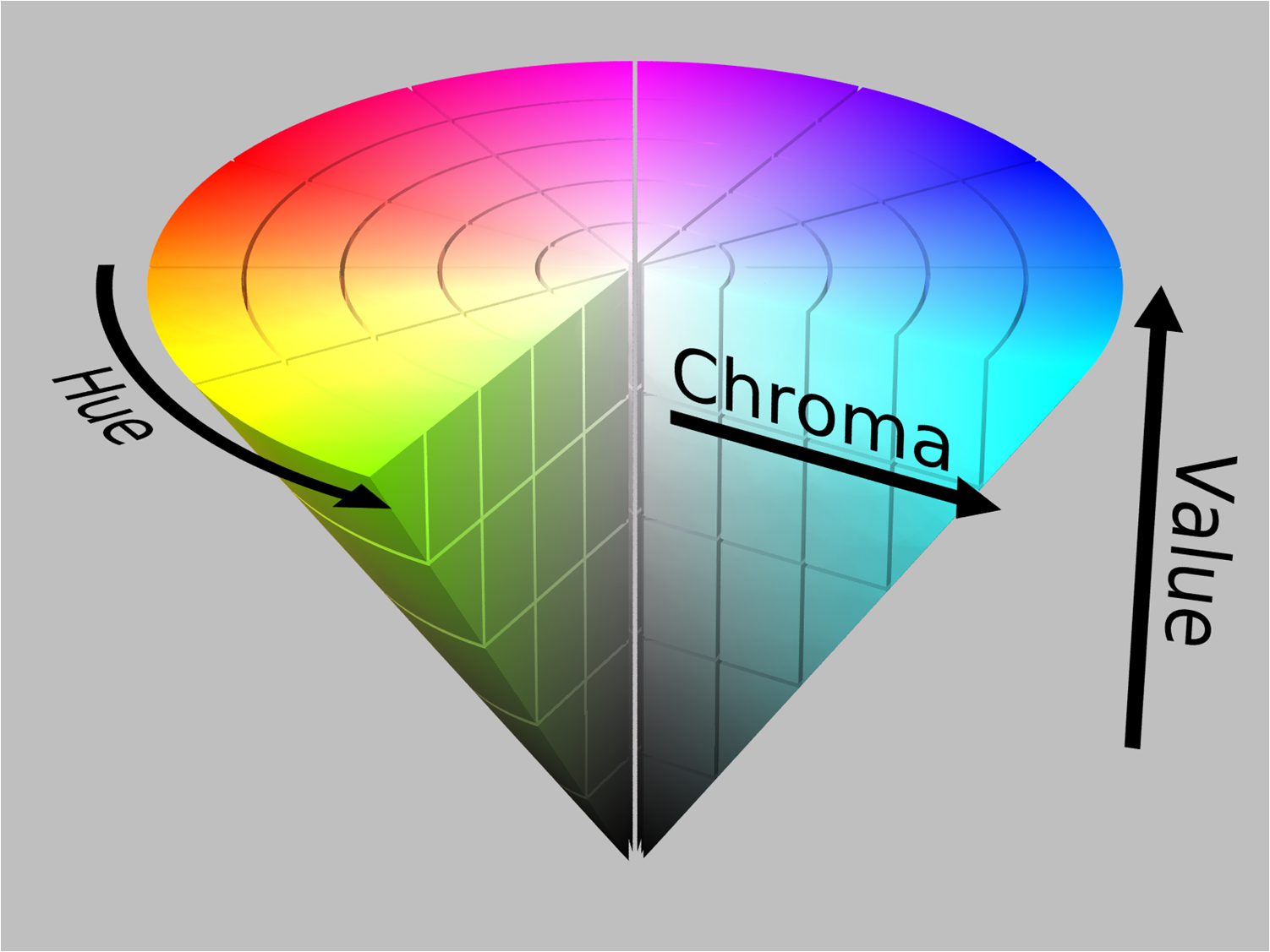
It is also better because it reflects the reality that we are more tolerant of change with brighter colors. Imagine two rays radiating out from the center. Say they are 1 degree apart. Close in these rays are close together. Farther out these rays are further apart. This mimics the increasing tolerance our eyes allow the further we go out from the neutral center.
But I speak rashly if I say this is a better model than the Lab. Perhaps it is wiser to say that it has advantages in describing the color space, but it is not perfect. Our biology makes any model imperfect. The best that color theory can do is to create models that mimic our perception of color but which will always fail in some regard.
Color Theory, Biology and Gender
In case you did not know, there is a difference between the sexes. Women are better at perceiving color. In jobs whose principle skill lies in distinguishing color women have an advantage.
Men are far more likely to be color blind, but even excluding the color blind men, women generally are better at identifying the differences between the color. However, it is a skill. It can be learned. A man who spends much of his time working with color will become more perceptive than a woman who never has to consider color.
I have become fairly good at comparing colors. I can say that this paint has more red and yellow in it than that paint. But it is rather like sports. I can practice soccer every day and become fairly skilled at it, but someone else who is more naturally coordinated could practice just as much and become much better.
A little knowledge of color theory might help my skill set, but there are many people who have better natural talent with color than I have.
Color Memory and Color Theory
However, this natural edge that women have in color perception does not carryover into color memory. Neither man nor woman is gifted in this field. Our brains don’t remember color very well. Nor can we improve our color memory with practice, or so the research indicates.
We can remember colors that are associated with certain objects, as I can remember the red of a cardinal or the blue of a bluejay. What is difficult is to be given a look at a color, have that color removed, and the to be expected to pick it out again amidst a collage of similar colors. As soon as our eye hits the new group of colors our memory starts to fade. The color we are supposed to remember is soon supplanted with the new colors we are viewing, until it is impossible to know which are new memories and which is the old memory.
In this case it turns out that I have a much better color memory than my wife. I trust her eye with colors, but I do not trust her memory. This came out during a recent furniture shopping trip. She insisted that one particular chair would not go with our rug, while another would. I was sure she was wrong, but somewhere along the 26 years of marriage I learned to keep my mouth shut.
When we got home she realized that it didn’t match and the other chair would have. Later that day I purchased a new rug.
The lesson here is that you better take your color samples with you. Color theory is good to know, but that theory works best when you can make side-by-side comparisons. Paint chips and fabric swatches need to go with you when shopping for your home. It will help with your marital bliss and overall satisfaction with your decorating.
House Design - Home
Please!


See my Architectural Design Principles Sections
See my Greek Revival Sections
Solve your Garage Door problem here
Investigate the Georgian Style here
See the old Victorians here
Confused? Try my Architectural Dictionary
Tired or Suburbia? Check out your alternatives here
New! Comments
Have your say about what you just read! Leave me a comment in the box below.