Art Nouveau
The term “ Art Nouveau ” translates into “New Art” which was an apt description at the time it was coined. The term was first used in 1901, but in Germany, where it was known as “Jugendstihl” or “Youth Style”, the term originated in 1896 with a publication of a magazine of the same name.

It is not entirely correct to say that Mucha originated it. Other artists were working towards a new style, and they were all influencing each other, but it was Mucha that created something that caught the public eye and other artists started moving towards what Mucha was creating.
As Art Nouveau was picked up by more artists it moved into new media. It was used throughout the decorative arts, often for household items and soon had influence within the field of architecture. The style overlapped with the Arts and Crafts movement in England and the United States and influenced each other.
The style had different variants, and different names, in different countries. What they shared was a flowing, curving style incorporating natural elements. In keeping with the Gothic Revival that preceded, it depicted items from nature in a stylized rather than realistic form. In the “Gismonda” poster that launched the style we see an asymmetrical layout, flowing robes and flowing hair, a repetitive pattern of griffins and flowers that could pulled straight from a medieval tapestry and the use of a currying font of varying thickness. All these are signposts for the style that followed.
I am including various photos to show how the style played out in different media, with different artists and in different countries. I explain its impact on architecture in my article on the architecture of Art Nouveau.
Louis Comfort Tiffany was heavily influenced by Art Nouveau, and many of his lampshades and stained glass windows are considered masterpieces of that style. There were others creating beautiful glassware in the art nouveau style but Tiffany was the most famous artist in this genre. I have found a picture of a Tiffany window that illustrates the style rather well. This is from a building in New South Wales, Australia. The type font is typical of the style. There was not a single font, but the fonts used in Art Nouveau have a similar look. The rose vine curves around and this type of sinuous flowing of a design element was found in most works In this style. The rose is the focal point and the object of attention, but there is a lot of activity in the background, with little secondary pictures being formed at the base and in the corners. Art Nouveau was visually rich and often ran the risk of having so much going on as to distract from the central theme of the piece in question.

Another characteristic we see in this window is an avoidance of sharp angles. The leaded mutins form a background grid, but the image itself is all curves. In those places where we might expect a sharp angle the image seems to go out of its way to avoid this. The only exception to this is the framing formed by yellow glass. In the very upper corners we see the only sharp angles of the design.
In this brooch by Rene Lalique we see a peacock against a background formed by his own feathers. The peacock himself is close to realistic, but he is set in contrast to a fantastical display of his own feathers. Once again we see a sinuous form and a very busy background. In this case the background itself dominates the foreground. We see the feathers before we see the peacock. The bird provides context to the background, but it is the background that is important.

Compare the peacock to this 1897 soap advertisement by Mucha. Here the face is dominant, but the head itself gets lost amid the headpiece, the flowing hair and the busy background. It is a wonderful picture, and one I have used as a screen saver for many years. The one style exception in this picture is the use of a traditional type font in the advertisement.

In this soap advertisement by Adolpho Hohenstein we have two girls realistically drawn. Take away everything else and you have a traditional picture. It is a lovely picture and it tells a story and draws you in, but there is nothing Art Nouveau about it until you add the background and framing elements. At the bottom the bubbles are forming their own motif and mixing in with these strange white flowing tendrils of something. Perhaps they represent the scent of the soap. Whatever the case they provide an Art Nourveau-ish counterpoint to the central picture. Unlike with the peacock broach or the perfume girl, these girls stay dominant. The stuff at the bottom never steals the show, it simply effects how we interpret the focal point.

Below the bubbles and the scent the background is so much lighter than the rest of the picture as to seem like blank space. The effect is to create a picture whose shape is not the straight edges of the page, but the curved lines of the scent. Again, this is an example of the style avoiding the straight in favor of the curve.
At the top of the photo we have another interesting font, not at all like the font used by Mucha for the Gismonda poster. Yet it is definitely not a traditional font. In fact, looking closely, we have three different fonts employed. I am not ready to say what constitutes an Art Nouveau font, as we are seeing a variety.
Now consider this Nestle mother and child by Mucha. We have dropped the realism. This is a two-dimenional family, but the background patter is looking familiar in its complexity. She has a mosaic pattern behind her. We saw something similar at the top of Gismonda poster. Around the mosaic tiles is an arc of a repeating pattern that is so stylized as to have lost its identity. You can’t tell what it is. In the corners below the title there are strange birds against a background of white branches. None of this background has to be here. The family scene could stand alone, but it wouldn’t look nearly as interesting, and it would be something besides Art Nouveau.

Before I leave the world of illustration I want to show off this wonderful magazine cover, also by Mucha. The girl is dominant below, but our eye is definitely distracted by the strange feathers (or whatever they are) radiating out behind her. It is only when our eyes wonder up to the title and spots the continuation of the artwork behind the title that we realize that the green background behind the girl is actually a giant horse. It is a strange, phantasmagorical picture.
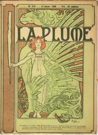
In this picture we have one of our rules violated. This has plenty of sharp corners, with the strange “feathers” getting cut off sharply at the ends. Otherwise we have the sinuous flowing motif at the bottom, below the horse, the horses own flowing locks, a complex, complicated background and another interesting font.Finally, to show that simplicity could also be found within this movement, we have a china pattern offered by a German company. Here we have one basic design repeated three times. The design seems to be of something natural. The green items seem to represent leaves, and for some reason I am reminded of lotus leaves floating on the surface while tethered to the bottom of the pond. Whatever the intention the object has become so stylized as be unrecognizable.

I will show more examples of Art Nouveau in my article focusing on art nouveau architecture.
You may also be interested in reading about Art Deco, a continuation of the Art Nouveau style that arose in the 1920’s.
To Top of Page
To Art Nouveau Architecture
Return to House Styles
Home - House Design
Please!


See my Architectural Design Principles Sections
See my Greek Revival Sections
Solve your Garage Door problem here
Investigate the Georgian Style here
See the old Victorians here
Confused? Try my Architectural Dictionary
Tired or Suburbia? Check out your alternatives here
New! Comments
Have your say about what you just read! Leave me a comment in the box below.