Window Architecture
Window Architecture: Creating Patterns and Filling in Blanks
This continues my look at window placement. Here I consider real homes and the lessons we can draw from how others have handled the placement of windows.
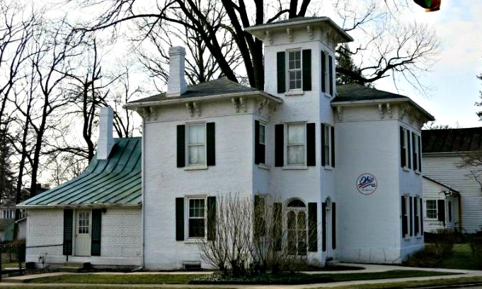
The house below in the old Flytown section of Columbus, provides a useful lesson. With this octagonal tower you are naturally going to have your windows line up vertically, but the little short window on the second floor creates a bit of a problem horizontally. It is flush to the same level on top but is serious mismatch on the bottom.
Perhaps it is one of my beloved piano windows mentioned in my previous article. Unfortunately the effect on the outside is a rather awkward blank spot on the house. If this were on the ground floor you would plant a tall bush there and your problem would be solved.
In this case the easy answer would have been to match the windows. Assuming there is a need to have the smaller window I would suggest some creative brick diapering. That is a term for patterned brick work. However, colored brick forming a diamond-shape would tend to become the focal point for your eye, what with the centralized placement on the one part of the house that stands out from the rest.
Perhaps using rough-faced bricks to create a shadow pattern in the shape of the adjoining windows would suggest the balance and order you want to achieve without competing for attention.

Window Architecture and Unusual Windows
Below is another tower, and one with round windows. I am getting a two-fer in talking about this picture. Yes, round windows will draw the eye, but in this case they form a pattern around the tower, and that pattern is what we notice, not any individual window.
It is all part of how we view the world. We naturally connect individual elements together to observe patterns. That is part of the reason that we like our windows to be in-line. It forms a pattern. It helps us make sense of the individual elements, which is pleasing to us. It is when we can’t resolve how an element fits into the whole that we feel discomfort.
In this case we have an interesting framing of the round windows. Each is centered in a square, which is painted a contrasting color from the pilasters separating them. This creates a pattern within a pattern, order within order. It definitely draws the eye to the top of this tower, but the view is pleasing once we get there.

Window Architecture on The Tower
Let me complete my tour of towers with this house from Fenton, Michigan. The horizontal connection between windows is usually stronger than the vertical. Here the narrow tower walls only allow for a vertical connection. Our eye sees this vertical connection and it leads us right up the tower. The three stacked windows brings the tower into prominence. While it would tend to stand out anyway, if the top floor lacked windows, the tower would be diminished. We wouldn’t notice it as much.
Conversely, If it had windows that did not line up with the lower windows our eye would be drawn upwards only to end in an incongruity. The tower would stand out, for the wrong reasons. Our mind would be disappointed or uncomfortable and we would not like it. We would remember this house, but only that one part that bugged us.
Dormer Window Architecture
Next I have a couple of dormer windows to show, but unusual ones. The first are two eyebrow windows. The windows allow in little light. The attic is probably only used for storage. These windows are only here for the external effect. They provide an interest to the house it would otherwise lack.
I have seen some eyebrow windows used to good effect but I am not sure that they add much value to this house, although I don’t see that they hurt the house, except that they seem a little too far apart.
Below that is an eclectic little mix of Art Deco and Classical. Here again the dormers appear to be for external effect only. The windows are too small to let in much light. It is a neat house that you won’t find anywhere else. In the 1930’s some architect was trying to engage the new art, but bringing all he loved about the classical forms along with him. The dormer windows were part of that effort. They are the one thing that clearly says “Art Deco”.
It is interesting to note that in both of these photos the windows were the one bit of unexpected ornamentation that made the house unique, and both were effectively sham windows.


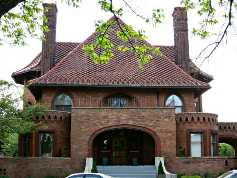
Window Architecture: A Supporting Role
I had reservations about including this next picture. The windows are not the story here. The roof and the gaping entry arch steel the show. The windows here are in a support role. Their goal is to subtly reinforce what is going on with the rest of the house. Their entire job is to stay on message. Don’t do anything that detracts.
The arched windows on the second floor do that well. Here is where I am supposed to provide brilliant insight into why it works, but I can’t. I just know that I like it.
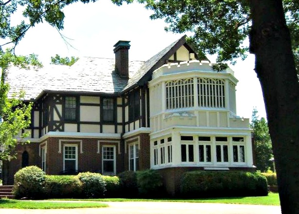
Window Architecture and Period Homes
Below are two examples of a large bay window on a Tudor house. The top one is large enough to qualify as a solarium or sun room. Both stand out from the rest of the house because of the position and because of the change in materials and color.
In the top picture the extension of the house is an aesthetic flop, at least from the outside. It makes the house less attractive. I would rather buy this house without the two-story solarium than with it. Yet the windows aren’t alone in taking blame.
My chief complaint with these windows is that they don’t sell the architecture. It should look like a 16th century addition on a 15th century house, but it instead looks very much like a cheap 20th century imitation. The house behind looks much more realistic than does the extension.
Part of that is the framing of the windows. Between each section of the second floor window is a very narrow vertical framing member. Whether it is imitating stone or vertical posts it seems too thin to support that heavy castellated balustrade.
The mansion below is named Harwelden. It was built with oil money and it costs quite a bit more than the house above it. Perhaps it was all that money that allowed them to use masonry, and leaded muntins in the window. A muntin is the framing that separates the individual window panes, and this window is made much as you would have found it in Queen Elizabeth’s time.
Let’s just say that this bit of realism completes the sale. Had I told you that this house was from England you might have believed me.
While period piece homes are common, and there are a lot of ways that they can flop, it is often the case that the windows are the culprit. While money limits most people if you are going to tell a story with your house tell it right. Don’t lavish all your money on the cladding and the roof and then forget about the windows until after your bank account runs dry. Plan from the first to consider the windows as part of the total look of the house.

Modern Homes and Window Architecture
I now turn my attention to some contemporary homes. They aren’t particularly new, but they are both rejections of earlier housing styles. The top is a California Contemporary and the latter an Art Deco home.
Both use windows as part of their identification. Large plate glass windows weren’t possible until the 20th century and architects who were pushing the envelope made full use of this new product. No individual panes divide the window. Muntins are banned.
Some modern houses were sheathed in glass. These don’t go that far, but you will note that the one first floor room to the right of the tower has one wall that is almost entirely glass.

The white Art Deco house is a little different. Here the windows don’t cover that much area, but the architect is still exploring the use of new materials, in this case steel framing. The ribbon windows with their little thin mullions, the vertical members separating windows, would not be possible with other material. The wall above the window would sag.
With ribbon windows the architect could emphasize the horizontal to a whole new degree. In this case I don’t think he went far enough. I appears to me that he needed more windows and his placement is poor. Look at the windows on the right. They don’t line up vertically. They stair step, but since there is no third floor you don’t have enough to create a pattern. He might have done better to extend the second floor ribbon more to the left and had a much longer ribbon centered on the lower window.

This concludes my section on the placement of windows. In future articles I will look at the types of windows and different window materials.
To Top of Page - Window Architecture
To Fenestration
To Window Types
To Double Hung Windows
To Interpreting Energy Star Window Labels
Home - House Design
Please!


See my Architectural Design Principles Sections
See my Greek Revival Sections
Solve your Garage Door problem here
Investigate the Georgian Style here
See the old Victorians here
Confused? Try my Architectural Dictionary
Tired or Suburbia? Check out your alternatives here
New! Comments
Have your say about what you just read! Leave me a comment in the box below.